Automated Data Pipeline for Canary Islands Air Transport Statistics
TL;DR
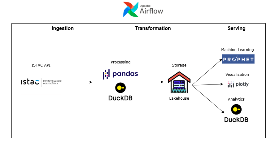
This project is an automated data pipeline that collects, processes, and visualizes air transport statistics from the Canary Islands, updating itself monthly. It was built using Python, DuckDB, Prophet, Plotly, and Apache Airflow, following a data lakehouse approach where structured CSV files serve as analytical data sources.
Throughout the project, I practiced:
- Designing and implementing end-to-end ETL batch pipelines with modular Python scripts.
- Data modeling with star schema
- Use DuckDB to run SQL queries directly on CSVs for analytical queries and data transformation.
- Developing forecasting models (Prophet) and automate retraining as part of the pipeline.
- Deploy interactive dashboard with lots of data via GitHub Pages under real hosting constraints.
- Set up workflow orchestration using Airflow (pip install) after troubleshooting Docker and deployment issues.
Update 21/01/2026
I originally published this post in October 2025. Looking back at the project with the knowledge I have now, I realize that I made several mistakes:
-
This is not a data lakehouse, it’s a data lake. At the time, I thought that simply planning the table structure in advance would qualify the project as a lakehouse. After experimenting with Delta Lake in an assignment from the master’s program I’m currently studying, I realized that this is not how data lakehouses work. A data lakehouse requires a tool that provides a transactional layer and data warehouse–like features such as ACID transactions, time travel, and schema enforcement and evolution. This project does not have that—it’s just a data lake.
-
The data modeling is incorrect. Fact tables should only contain keys and measures. However, in my fact tables I store a date column (
Month), which breaks the rules of multidimensional modeling. To be correct, I should have added a Time dimension and referenced it via a key. It would also have been a good idea to add surrogate keys to the fact tables. -
My assessment of pandas was too optimistic. Back in October, I wrote: “Honestly, if the project is more data engineer oriented (handling larger datasets, joins, or aggregations), DuckDB might be a better choice than pandas.” Now I know that pandas is not that good for handling large datasets, mainly because it is slow and requires the entire DataFrame to fit in memory. For this kind of use case, tools like Polars, DuckDB or Spark for larger datasets are far more appropriate. In fact, I could have used DuckDB alone for the entire project.
-
Airflow was massive overkill. I already mentioned in october that using Airflow for this project was unnecessary and that simple cron jobs would have been a better choice. Turns out I was absolutely right. One day Airflow just stopped working, and I don’t have the time to reinstall it and get everything running again.
Project Overview
This project implements an automated data pipeline that collects, processes, and visualizes air transport statistics from the Canary Islands. The system is designed to update itself automatically every month, producing analytical dashboards that track trends in passenger traffic, airport operations, and territorial connectivity.
The goal was to build an end-to-end data solution — from raw data ingestion to visualization — following modern data engineering concepts like the data lakehouse architecture and pipeline orchestration.
I chose this data because tourism is the most profitable and important sector in the Canary Islands, so I wanted to showcase something relevant and useful related to it.
Project Structure
The project began with data exploration and modeling. I analyzed available air transport datasets and designed a plan that followed clear steps:
- Data modeling
- Pipeline into data lakehouse
- Setup of DuckDB
- Analytical queries
- Visualization design
- Predictive modeling
- Dashboard visualization
- Orchestration
- Deployment
After prototyping a map visualization, I confirmed it was feasible to host interactive dashboards directly on GitHub Pages — which guided how I structured my data model and storage strategy.
Development process
The next step was to create the data pipeline that would ingest and transform the raw data.
I designed dimension tables (like Airport and Territory) and two fact tables:
TrafficPerTerritory (aggregated by island)
TrafficPerAirport (aggregated by origin and destination airports)
Initially, I planned to upload these tables into DuckDB, but after experimenting I realized I could query the CSV files directly using DuckDB’s SQL interface — adopting a data lakehouse approach (structured files in directories, queried as if they were database tables). This is wrong, see correction
This allowed flexibility and avoided unnecessary data duplication. Also I want to add how amazing DuckDB really is, super simple, super fast, you can use it in your python code and process data with SQL (wich sometimes it’s better than using pandas), as a regular database… Honestly, if the project is more data engineer oriented (handling larger datasets, joins, or aggregations), DuckDB might be a better choice than pandas.
Once the pipeline was ready, I created analytical queries using DuckDB, just to test how fast it was and for fun.
For the visualizations, not going to lie, it was mostly ChatGPT. Visualizing data isn’t really my main interest, I do it because it’s necessary. What I really enjoy is building the architecture to move, process, and model the data.
Finally, with the pipeline and visualizations scripts ready, the final step was automation.
Initially, I attempted to orchestrate the pipeline using Apache Airflow in Docker, but faced issues mounting the repositorie, because I needed to push the data from the Airflow container and from my local machine. So in the end I just decided to install Airflow locally via pip. This solved the issues and allowed me to run DAGs smoothly.
Airflow now:
- Runs the full data pipeline monthly.
- Trains the forecasting models.
- Regenerates updated visualizations.
In reality, for a simple project like this one Airflow is not necessary, just a cron job would have been fine. I implemented it just to learn Airflow.
Possible Improvements
Since this project runs on my local machine, Airflow isn’t active 24/7 — meaning I have to remember to turn it on once a month. The most logical improvement would be to migrate the entire pipeline to the cloud, where it could run automatically without manual intervention.
Staying in the cloud domain, another major enhancement would be to host the dashboard on a web server or cloud platform instead of GitHub Pages. Currently, the page loads all the data at once, which can make it laggy when opening or changing filters. Serving it from a backend would allow querying and loading only the necessary data, resulting in a much smoother experience.
Lastly, the dashboard design could be more polished and professional. It works and serves its purpose, but aesthetics aren’t really my focus like I said before. However I would like to make it more responsive so it can be seen in mobile. Right now it only shows properly on pc.